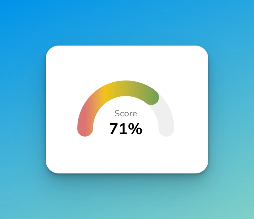
I recently worked on creating an SEO analyzer for Hyvor Blogs, which required a score meter to display the SEO score. This is a short guide on how I designed it. The final result will look like this:
We’ll be using React, but you can easily use the same concept with any other framework. The ‘react part’ is quite trivial.
Full Code on Codepen
See the Pen Untitled by Supun Kavinda (@SupunKavinda) on CodePen.
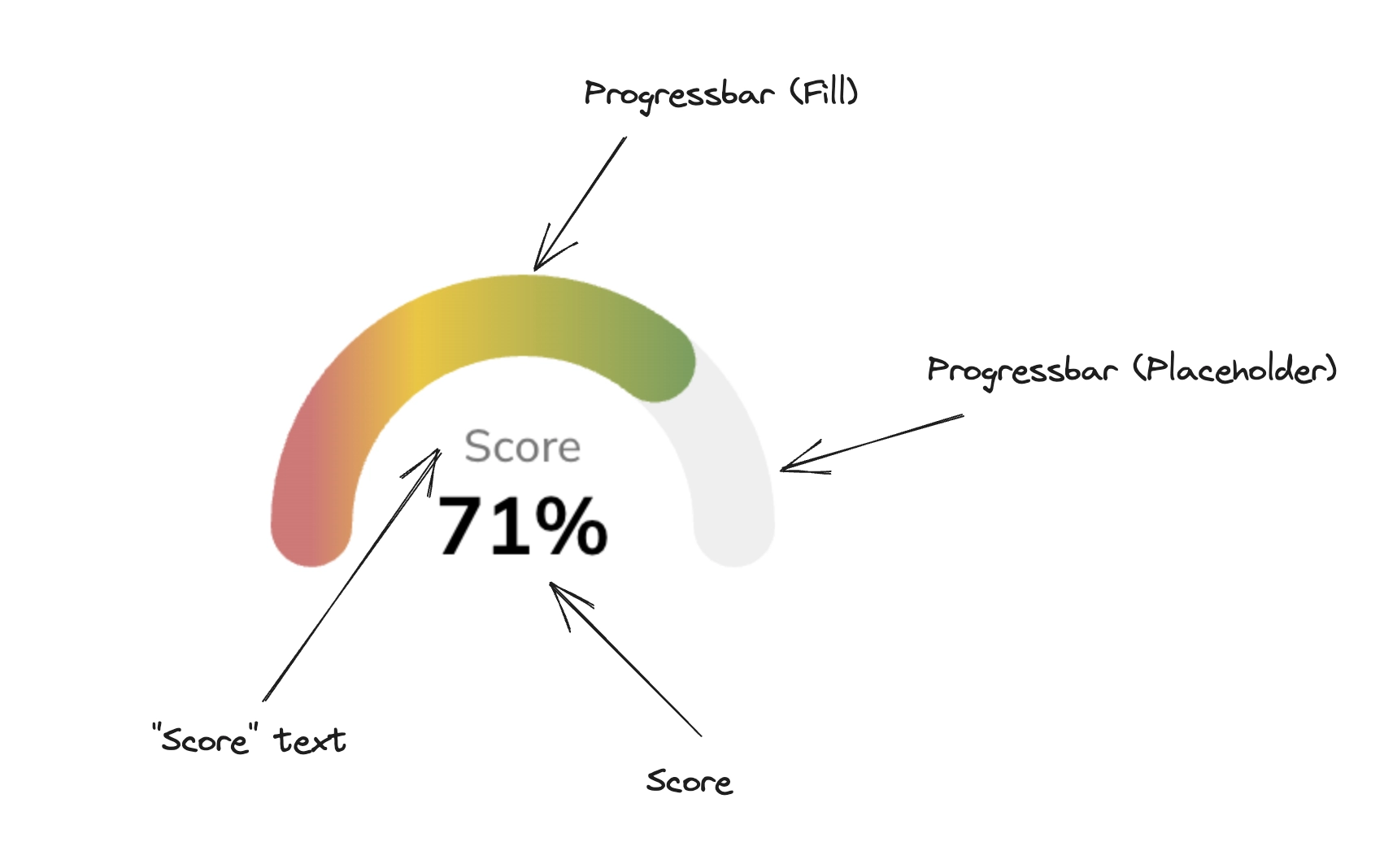
Parts of the Score Meter
These are the parts of the score meter. We’ll be using SVG for the progress bar.
Building the Score Meter
1. Main Component
This is what the main structure would look like. It takes one prop: score, which is a number between 0 to 100.
1export default function App({ score } : { score: number }) { 22. Progress Bar SVG
Now, let’s design the progress bar component, the svg used for both the placeholder and the fill.
1function progressBar(widthPerc: number, gradient: boolean = false) { 2 const radius = 65; 3 const dashArray = (Math.PI * radius * widthPerc) / 100; 43. CSS
Add some CSS to position the text and the progress bars correctly.
1.score-wrap { 2 display: flex; 3 justify-content: center; 4 margin-bottom: 20px; 5} 6.score { 7 width: 200px; 8 height: 120px; 9 position: relative;10 overflow: hidden;11 display: flex;12 align-items: flex-end;13 justify-content: center;14}15Progress Bar SVG Explanation
I think the main component and CSS parts are self-explanatory. I’ll explain how the SVG works step-by-step.
First, add a circle in an SVG canvas:
1<svg width="200" height="120">2 <circle3 cx="100"4 cy="100"5 r="65"6 ></circle>7</svg>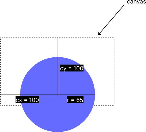
Then, remove the fill and add a stroke.
1<svg width="200" height="120"> 2 <circle 3 cx="100" 4 cy="100" 5 r="65" 6 fill="none" 7 stroke-width="25" 8 stroke="#e5e5e5" 9 ></circle>10</svg>
Then, most of the magic is done using stroke-dasharray and stroke-dashoffset.
stroke-dasharray allows you to define a pattern for dashes and gaps. For example, if you add stroke-dasharray=”20”, you will see something like this.

Then, adding stroke-linecap=”round” gives you nice rounded dashes.

Let’s do some calculations to set the stroke-dasharray property correctly. In our React code, we use the following:
1const dashArray = (Math.PI * radius * widthPerc) / 100;2// ...3strokeDasharray={`${dashArray} 10000`}Math.PI * radius is equal to half of the circumference of the circle. That’s what we need for the placeholder of the progress bar (fill depends on the current score).
Note: the
10000instrokeDasharrayis the gap. Because, we only need one dash, I used10000to add a large gap to make sure only one dash is drawn. You can set it to anything larger than πr.
So,
1Math.PI * radius2= 3.14 * 653= 204.2When we add it to our circle:
1<svg width="200" height="120"> 2 <circle 3 cx="100" 4 cy="100" 5 r="65" 6 fill="none" 7 stroke-width="25" 8 stroke="#e5e5e5" 9 stroke-dasharray="204.2 10000"10 stroke-linecap="round"11 ></circle>12</svg>we get this:

Finally, let’s use stroke-dashoffset to change the position where the first dash is drawn. In our react code, we use strokeDashoffset={-1 * Math.PI * radius}. So,
1-1 * Math.PI * radius2 = -3.14 * 653 = -204.2So, our final SVG code looks like this:
1<svg width="200" height="120"> 2 <circle 3 cx="100" 4 cy="100" 5 r="65" 6 fill="none" 7 stroke-width="25" 8 stroke="#e5e5e5" 9 stroke-dasharray="204.2 10000"10 stroke-linecap="round"11 stroke-dashoffset="-204.2"12 ></circle>13</svg>we get what we need!

This is the placeholder of the progress bar. In the fill, we use a gradient. Both are positioned on top of each other using CSS.
Final thoughts
While the score meter UI seems simple, creating it correctly takes some effort, especially if you are not very familiar with SVG. I hope this article helped you learn about SVG circles, dashes, and gaps. Feel free to reuse the code in your projects.
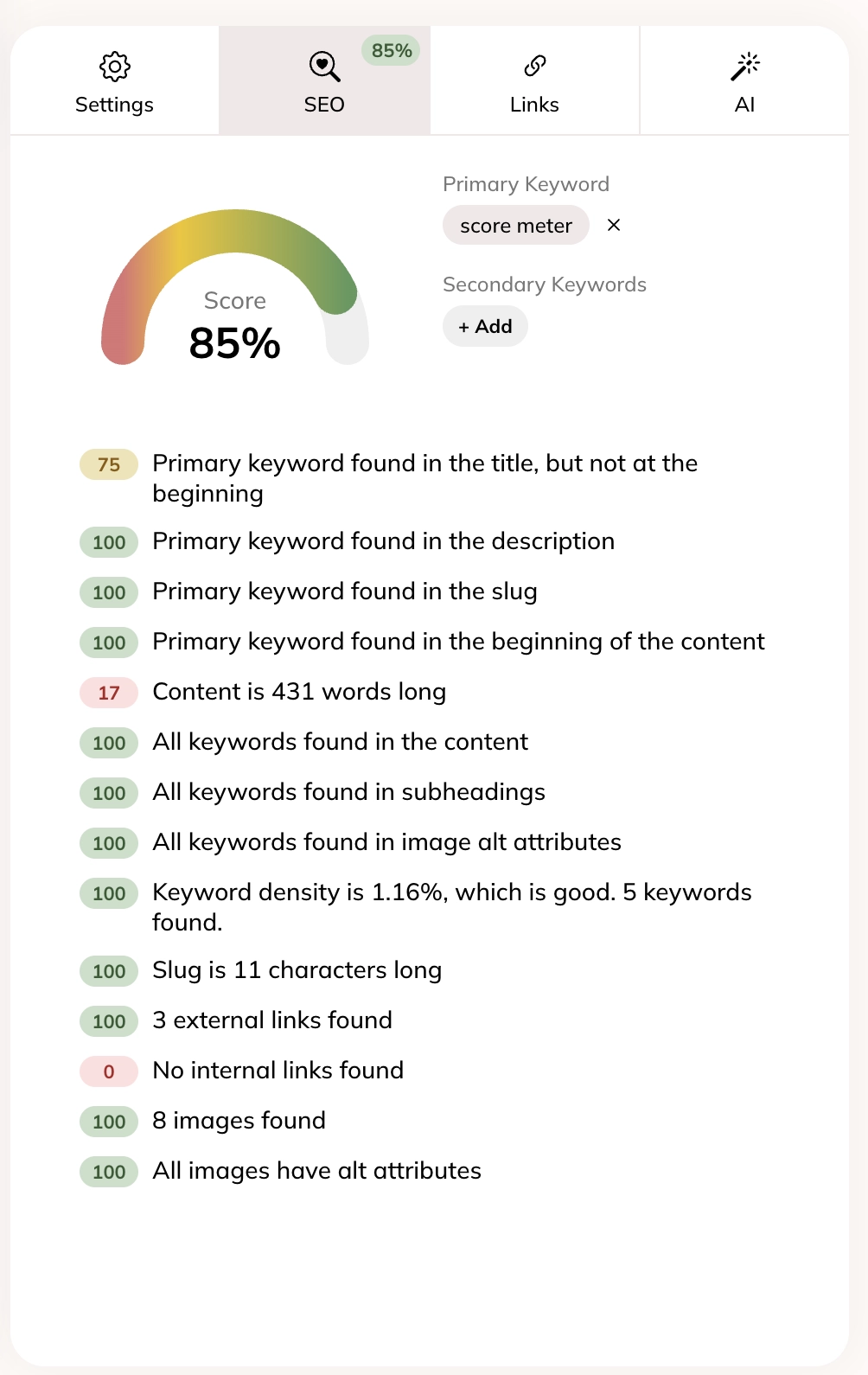
As mentioned earlier, I wrote this score meter for the SEO analyzer of Hyvor Blogs, which analyzes blog posts as you write and gives you feedback in real time. Here’s what it looks like for this post:
Check out Hyvor Blogs and all the features that make blogging super easy.
If you have any feedback on the article, feel free to comment below.
Comments